Q&A with CData Product & UX/UI Teams: Latest Updates to CData Sync

You shared feedback and the CData team listened: CData Sync is getting a major UX/UI (user experience/user interface) refresh to make it easier and quicker for our users to navigate the interface.
Jaclyn Wands, CData Director of Product Management, and Jessica Ritchie, CData Manager of UX/UI, gave us an inside look into their effort to revamp Sync’s UI and how it will make the data integration tool even more powerful.
1. What inspired the UI improvements for Sync?
Ritchie: CData pulled together an awesome team that has turned a deep analysis of support tickets and customer enablement sessions into a full redesign of CData Sync’s UI.
User feedback was crucial in guiding us to three crucial areas that needed our attention:
- Design: Product design is constantly evolving, and one of our goals in this update was to modernize the look and feel of Sync’s user interface.
- Information architecture: We revisited the layout of content and adjusted it, making it easier for our users to easily navigate the tool and find what they're looking for faster.
- Accessibility: To prevent eye strain, we refined the UI’s color contrast to ensure the maximum comfort possible to all potential Sync users — especially those with vision impairments.
The Product team has been hard at work putting user feedback into action, and minor updates can be seen in the tool today. We’re now focused on making final improvements, and I’m happy to share that we will fully launch the Sync redesign in April.
Do you have a suggestion for how we can make CData Sync even better? Submit feedback here!
2. What are our goals regarding the UX/UI of CData Sync?
Wands: CData Sync has been a powerful, minimalist tool for a long time, but over the years customers have found ways to accomplish so much more than we had originally imagined for the product. We’ve been listening to our customers, and we’re focusing more resources on supporting your needs with clear, streamlined ways to “set and forget” your solutions in Sync.
For starters, Sync’s enterprise power users will find the product more searchable, more organized, and more capable of executing mass actions with large volumes of data. All users will find that increased usability decreases your time in the tool — which allows you to spend that time on other important tasks. I’m really excited for all our users to get value from Sync faster than ever.
Ritchie: We’re ultimately looking to provide a greater user experience that surfaces Sync’s more robust features for users to easily find and leverage in their day-to-day tasks.
3. What are some of the updates you’ve made so far?
Wands: We listened, we reacted, and we came out of the gate strong, executing changes to the UI that directly reflect our customers’ feedback.
Customers will now have access to more robust feature sets via a more intuitive user interface design. We also rebuilt the background infrastructure that gives our large enterprise clients easy access and control to adjust or change their data pipelines. We've also enhanced the application’s structure for even better performance.
We started by taking in direct feedback from our top power users before releasing the CData Sync UI redesign to the wider market.
"Really exciting and impressive... these UI improvements are going to help bring CData Sync into the team simply because of the ease of usability."
– CData Sync customer

Ritchie: Our usability testing participants bring robust experience with Sync that we’ve been able to leverage as a pivotal reference point. Now, these Sync users are astounded at how easy it is for them to accomplish their tasks. They feel confident that any person on their teams can be appointed to handle tasks in Sync without any additional training.
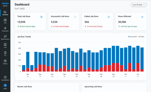
The Sync redesign is currently rolling out to the wider market in two phases. Last week’s soft launch features modernized upgrades to Sync’s navigation bar, dashboard, login screen, and logs page. This phased approach allows us the opportunity to hear from those of you familiar with our old UI before we roll out the complete upgrade next quarter.
Preliminary user interviews are already giving us solid proof that the Sync changes we’ve rolled out so far are a homerun.
"CData Sync’s new UI is incredibly intuitive, which is fantastic... it’s great not needing to do extensive training to use the new tool."
– CData Sync customer
4. What’s coming up for CData Sync this Spring?
Wands: Next quarter, every page is going to be upgraded when the complete UI overhaul comes to CData Sync.
Big enterprise-centric changes coming to Sync include:
- A 'views' feature, with metadata tagging and new saved views
- Improved ease of use, with jobs and connections
- Performance enhancements
We're making setup and monitoring so much easier, so you can spend less time in the tool and more time working with your data. We want you to trust that you can set Sync and walk away. And we're not stopping there! We’re always collecting customer feedback and taking user experience into consideration when we evolve Sync. CData is and always will be a software company where your feedback actually matters.
Do you have a suggestion for how we can make CData Sync even better? Submit feedback here!
Get Started with CData Sync
Ready to get started with the newly refined, highly-intuitive CData Sync? Get a free trial today!
If you’re already a Sync user and are ready to embrace the benefits of a streamlined experience, you can install the latest version here.


