Discover how a bimodal integration strategy can address the major data management challenges facing your organization today.
Get the Report →Import Spark Data into FileMaker Pro
Create reports that integrate Spark data in Filemaker Pro.
One of the strengths of the CData ODBC driver is its ubiquitous support across many applications and platforms. In this article, you will configure the ODBC driver in FileMaker Pro and create data visualizations with Spark data.
Query Spark Data in FileMaker Pro
If you have not already, first specify connection properties in an ODBC DSN (data source name). This is the last step of the driver installation. See the "Getting Started" chapter of the help documentation for a guide to creating a DSN on Windows or Unix-based systems like Mac OS X and Linux.
Set the Server, Database, User, and Password connection properties to connect to SparkSQL.
When you configure the DSN, you may also want to set the Max Rows connection property. This will limit the number of rows returned, which is especially helpful for improving performance when designing reports and visualizations.
You can then load Spark data into tables in Filemaker Pro:
-
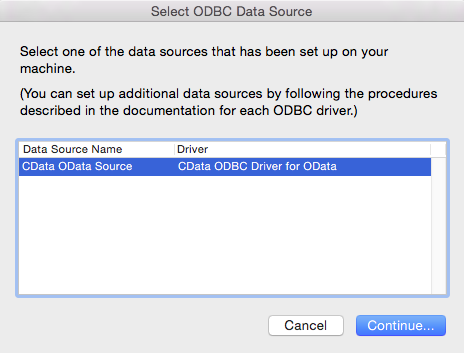
In your solution, click File -> Import Records -> ODBC Data Source, and select the CData Spark DSN.
![CData ODBC Data Sources to be added to a FileMaker Pro database.]()
-
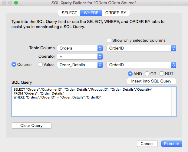
In the resulting SQL Query Builder wizard, select tables and columns and then click Insert into SQL Query. You can edit this query directly. For example:
SELECT City, Balance FROM CustomersYou can use the UI to build filters in the WHERE clause by clicking the WHERE tab.
![The import query defined in the SQL Query Builder. (OData is shown.)]()
-
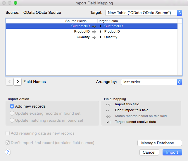
In the resulting Import Field Mapping wizard, you can define mappings from columns in the data source to the columns in a destination table. To create a new table for the query results, select New Table ("CData SparkSQL Source") from the Target box, and click Import.
![Mappings for a new table. (OData is shown.)]()
For more information on the SQL that the driver supports out of the box, see the help documentation.
Process Data at Design Time
You can sort and aggregate data, as well as calculate summary functions, while you browse tables. To manipulate the view of data at design time, first complete the two steps below:
- Switch to Browse mode: Click the Mode pop-up menu in the footer of the application.
- Switch to Table view: Click the table icon in the View As menu in the main toolbar of the application.
Aggregate and Summarize
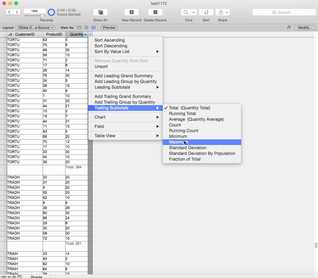
Follow the procedure below to group column values and then display a summary, as shown in the screenshot below:
- Sort: Click the arrow in the City column header and then click Sort Ascending in the resulting menu.
- Group: In the menu for the City column click Add Trailing Group by City to group the values and create a subsequent row where summary calculations can be inserted. Click Add Leading Group to introduce the group with a summary.
- Summarize: In the menu for a column that has been grouped, select a summary from the Trailing Subtotals menu.
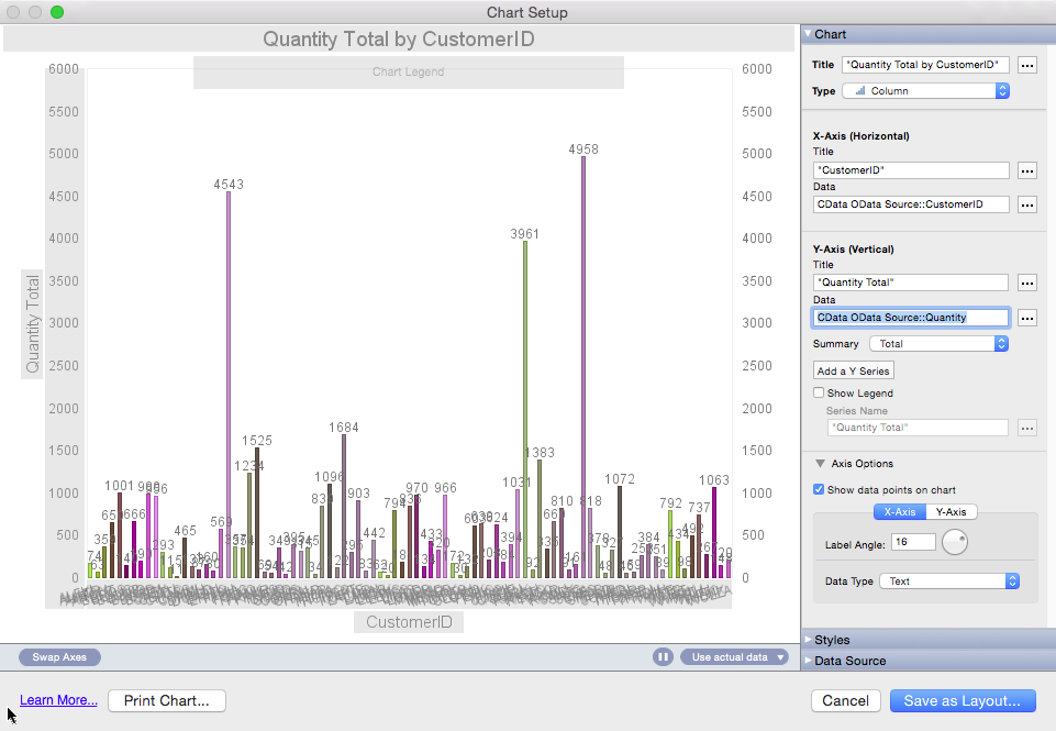
the procedure below to create a simple bar chart that shows the total Balance for each City.
- Click the arrow in the Balance column header and click "Chart by Balance" in the menu. If you have already grouped on a column in the Table view, City, for example, you can select the option to chart Balance by City.
- In the Chart Setup window, select columns to draw the chart: To add the column for the x-axis, click the button next to the Data box.
Selecting the x-axis and y-axis will draw the chart. You can also process data in the Chart Setup: Set the following options to create a basic chart.
- Click the button next to the Data box and select Specify Field Value. Select a column in the resulting dialog.
- Select a summary for the y-axis in the Summary menu.
